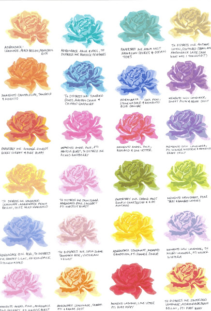
I recently purchased a floral stamp set that requires 3 step stamping, which is a new concept to me, mainly because it requires a degree of precision and colour co-ordination, both of which come fleetingly to me.
One evening I decided to sit and stamp as many colour combinations I could think of, now please bear in mind that this decision may or may not* have come about after drinking a glass of wine.
*it did, and it was two glasses.
I advise you of this because, some, if not all of the samples are stamped squiffily, I like to think that the jaunty angles add 'movement' to the piece and are in no way a reflection of my poor workmanship, and some of the colour combinations are examples of my journey into colour theory. Fine, have it your way, I am guilty of being drunk in charge of an acrylic block.
For your viewing pleasure I present the result of that evening's 'work'
Lemonade - AD
Peach Bellini - AD Mountain Rose - AD
|
Aqua – AD
Pool – AD
Peacock
Feathers - DI
|
Aqua Mist – PTI
Hawaiian Shores - PTI
Ocean Tides - PTI
|
Antique
Linen – DI
Scattered
Straw –DI
Latte -
AD
|
Cantaloupe
– MM
Tangelo –
MM
Morocco -
MM
|
Tumbled Glass – DI
Broken China – DI
Chipped Sapphire - DI
|
Cool Peri
– AD
Stonewashed
– AD
Danube
Blue – MM
|
Lulu Lavender –MM
Sweet Plum – MM
Grape Jelly – MM
|
Summer Sunrise – PTI
Berry Sorbet – PTI
Pure Poppy - PTI
|
Angel
Pink – MM
Hibiscus
Burst – PTI
Picked Raspberry
- DI
|
Angel Pink – MM
Rosebud – MM
Love Letter – MM
|
Lulu
Lavender –MM
Winter
Wisteria – PTI
Grape Jelly
- MM
|
Squeezed
Lemonade – DI
Peach Bellini
– AD
Dried
Marigold - DI
|
Spun Sugar – DI
Pink Sherbet – AD
Hibiscus Burst - PTI
|
Spring Moss
– PTI
Simply Chartreuse
– PTI
Ripe Avocado
- PTI
|
New Sprout – MM
Pear Tart – MM
Bamboo Leaves – MM
|
Cool Peri – AD
Shaded Lilac – DI
Stonewashed - AD
|
Spun Sugar
– DI
Tattered
Rose – DI
Victorian
Velvet - DI
|
Lemonade – AD
Dandelion – MM
Summer Sunrise - PTI
|
Lulu
Lavender –MM
Milled Lavender
–DI
Winter Wisteria
- PTI
|
Angel
Pink – MM
Pink
Sherbet – AD
Hibiscus
Burst - PTI
|
Lemonade – AD
Sandal – AD
Orange Zest - PTI
|
Ladybug –
MM
Love
Letter – MM
Pure
Poppy - PTI
|
Squeezed Lemonade – DI
Peach Bellini – AD
Pure Poppy - PTI
|
Key:AD
– Adirondack Dye Ink, DI – Distress Ink, MM – Memento Dye Ink, PTI –
Papertrey Ink Dye Ink.
|
|||
I also managed to get around to making a card. The background is also an example of 3 step stamping and I was pretty pleased with how it came out (it was my first attempt) and the rose just added the perfect finishing touch, it's one of my favourites in a long while and no doubt will be made again and again in different colour combinations :)
Cardstock - Bazzill. Watercolour Paper - Art Supply. Stamp
set and matching dies - The Sweet Life, Notepad, Papertrey Ink
Thanks for looking,
Ang x


Oh my gosh! You made me laugh out loud with this post! What a delightful way to spend an evening, stamping in it's purest form! Your card is a stunning color combo and very beautiful!
ReplyDeleteWow, what a fabulous reference! Nicely done!
ReplyDeleteAnd your card is gorgeous, too, Ang!
Wow I'm impressed drinking and stamping at the same time with great results.I'm going to try this ......soon. Thanks for sharing
ReplyDeleteYou should be please with that card - it's a beauty! love the colors and everything about it
ReplyDeleteThanks for the laugh! Love your colors. I too have been accused of drunk stamping.
ReplyDeleteLove this post. I need some wine. I may feel inspired. Great job
ReplyDeleteI tried to blow up your photo to read the ink colors you used but half were unreadable, maybe due to the wine.....?! Anyways, great job. This is a Paper Trey Ink stamp set right? Isn't it called something like "The Sweet Life"?
ReplyDeleteGreat post! Thanks for your hard work, I can only imagine what it would look like if that happened to me!! Thanks for sharing!!
ReplyDelete